Using R, ggplot2 and ggridges to render reefs
I recently came across an artistic use for the geom_ridgeline() function by Garrick Aden-Buie, where he created a neat twitter banner using R, ggplot2, and ggridges. Click here to check it out!
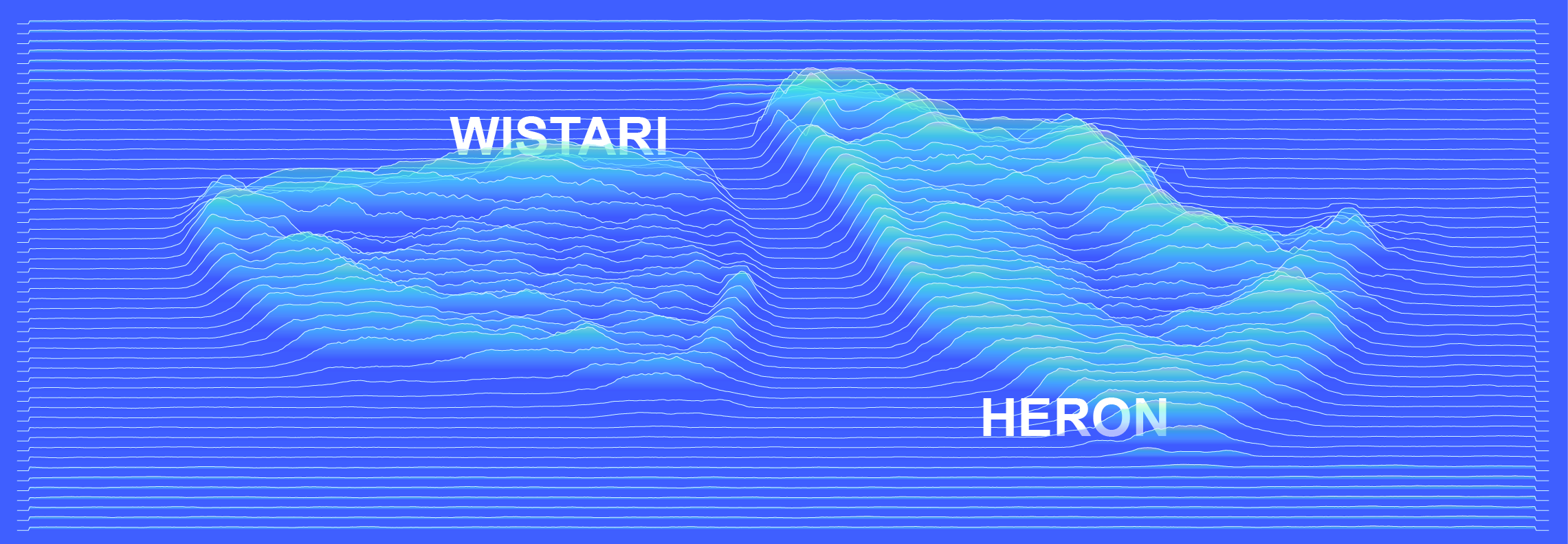
I thought it would be cool to adapt the code and try something similar on a satellite view of some of my favourite reefs. Lets see if we can achieve a similar effect, and recreate some of the spur and groove that Heron and Wistari reefs are so well known for, but in geoms and ridgelines.

First lets load in our R libraries
library(png) # For reading in our base image
library(ggplot2) # Plotting
library(ggridges) # ggplot2 extension that enables ridgelines
library(dplyr) # Standard data wrangling
library(purrr) # Data mapping
library(reshape2) # Data melting
library(zoo) # Rolling means
Next lets set a seed so that we can recreate the same image again and again.
set.seed(1234)
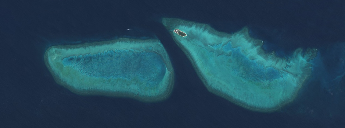
Our starting image was retrieved from the Sentinel-hub EO browser, using the L1C product, true colour bands (4, 3, and 2). Use the search function to find a day that is free of cloud. Here we are looking at Wistari reef on the left, and Heron reef on the right.

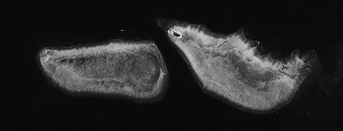
I then flattened the bands into a single channel grayscale image and boosted the contrast in a photo editor. This will create larger ridges then an image with a flatter profile. You can do this for in many different photo editors (photoshop, lightroom, gimp), and even free web tools, for example, Photopea.

We then read the image file into R.
heron_wistari <- readPNG("2019-01-20, Sentinel-2B L1C, True color_bw.png") # Tip: Image needs a lot of contrast
The next step is to convert the image into long format. Here we use the reshape2 function melt(). At the same time, we use dplyrs mutate() function to add some noise to the pixel values so that the ridgelines, even in areas of the image that had little colour variation (e.g. in the deep water), have some character.
hw_df <- heron_wistari %>%
  reshape2::melt(varnames = c("rows","cols")) %>%
  mutate(pixel = value + rnorm(length(value), sd = 0.01),
  pixel = case_when(pixel > 0 ~ pixel, TRUE ~ 0)
  )
Next we do some filtering, again using dplyr. Without this step we would have a ridgeline for every row (equal to the image height) of pixels in the original image. hw_df$rows is the column vector that contains the row coordinates, so we filter the rows in sequence from 0 to 421, which is the image height, and keep only 1 row in 8. You can play around with this step until you get the look you are after.
Here we also traverse the rows by grouping by rows, splitting the dataframe to contain individual rows, and use zoo rollmean() to smooth out the pixel colour data.
hw_df <- hw_df %>%
  filter(rows %in% seq(0, 421, 8)) %>% # Change to equal height of image
  group_by(rows) %>%
  split(.$rows) %>%
  purrr::map_df(~ {
    mutate(., pixel = zoo::rollmean(pixel, k = 20, fill = 0))
  })
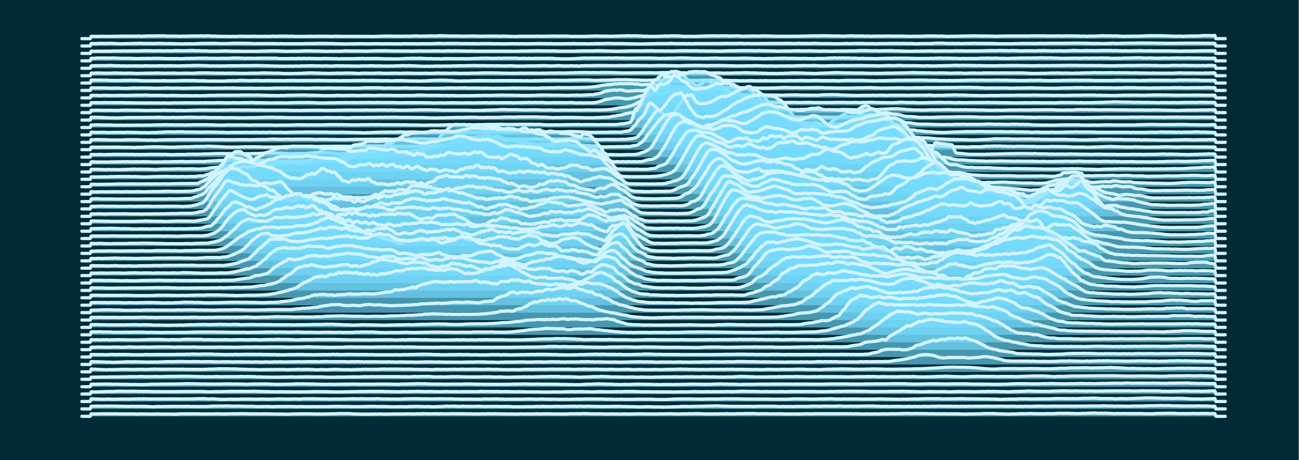
All that is left is to call ggplot2, pipe in the data (note that the rows have to be sent in reverse order to how we have them in the dataframe), and map pixels to the geom_ridgeline() height parameter.
Most of the code below is just fiddling around until you find the aesthetic you want.
theme_color <- "#002b36"

hw_df %>%
  ggplot() +
  aes(cols, -rows, height = pixel, group = rows) +
  geom_ridgeline(
    scale = 70,
    alpha = 0.6,
    color = "#d2f4ff",
    fill = "#77ddff") +
  theme_minimal() +
  theme(legend.position = "none",
    aspect.ratio = 421/1263,
    axis.text = element_blank(),
    panel.grid = element_blank(),
    panel.grid.major.x = element_blank(),
    panel.grid.minor.x = element_blank(),
    axis.ticks = element_blank(),
    axis.line = element_blank(), axis.title = element_blank(),
    plot.background = element_rect(fill = theme_color, color = NA))

I then export this to a vector format such as .pdf, and then put the final touches you see at the top of the page in a drawing software such as inkscape or illustrator.
Thats it!